I designed my own brand logo to give my work a unique stamp and a clear sense of identity. It’s built around two main design elements: The first letter of my name (G), and a cartoon character I’ve created and refined over time- which you can find in the Illustrations section of my portfolio.
This logo was created for a fictional CrossFit brand, "SharkAttarka" I wanted to design something that immediately communicates the intensity that's usually associated w/ CrossFit. The sharp, angular shark shape represents power, focus, and motion, while the clean lines and bold contrast give it a strong, athletic presence- A visual identity that captures the spirit of the sport.
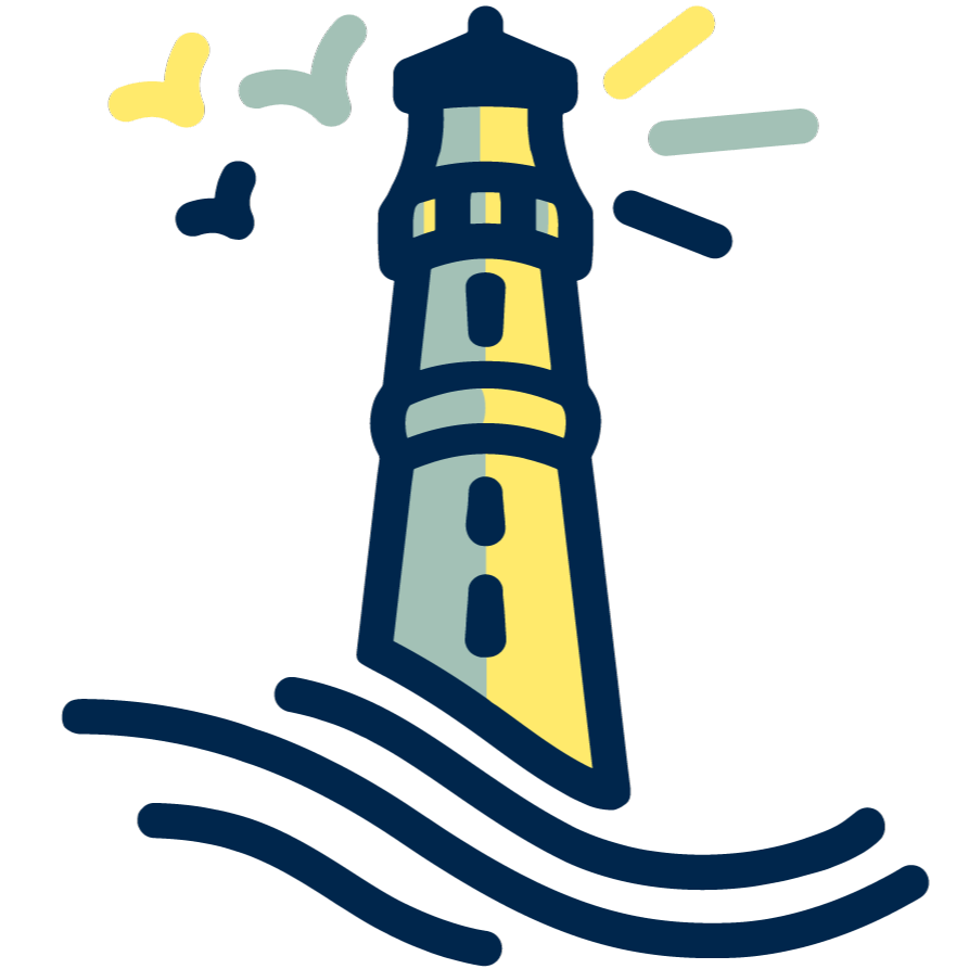
This illustration was created to honor a significant and influential figure, a guiding light. The recurring motif of three- birds, waves, windows, and tower sections- represents three children, symbolizing the connection between the children and the figure. Each element was thoughtfully designed to reflect this person’s presence and influence, resulting in a meaningful, personal memorial later engraved on a tombstone.


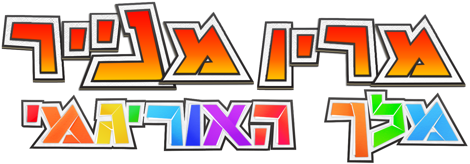
This logo was made for "The Return Of Bamba in Magical Kingdom"- a revival project of the original browser game. I reworked the old logo to keep its nostalgic charm, while refreshing the colors, shapes, and details to bring new life to a classic.